Relaunch!
Hello again! It's relaunch day! After a few crazy hectic days of redesigning, redirecting, coding, writing and more writing, the new website is finally live! I hope you like it ;)
Before I show you what's new around here, I want to again thank you all so much for your lovely emails and comments in response to my book announcement post! I'm so glad that so many of you are just as excited as I am, and I honestly cannot wait for September, when you finally get to read it!
Right now, we (my publisher and I) are still hard at work finalizing the design, the photo selection and the cover. But once we are done, I'll definitely be able to tell you all about what's in the book, show you sneak peeks and answer your questions.
Until then, I've got lots of new blog content lined up for you!
Two new big features that are already live:
- the fully updated and expanded 10 Step Wardrobe Revamp
- the FAQ
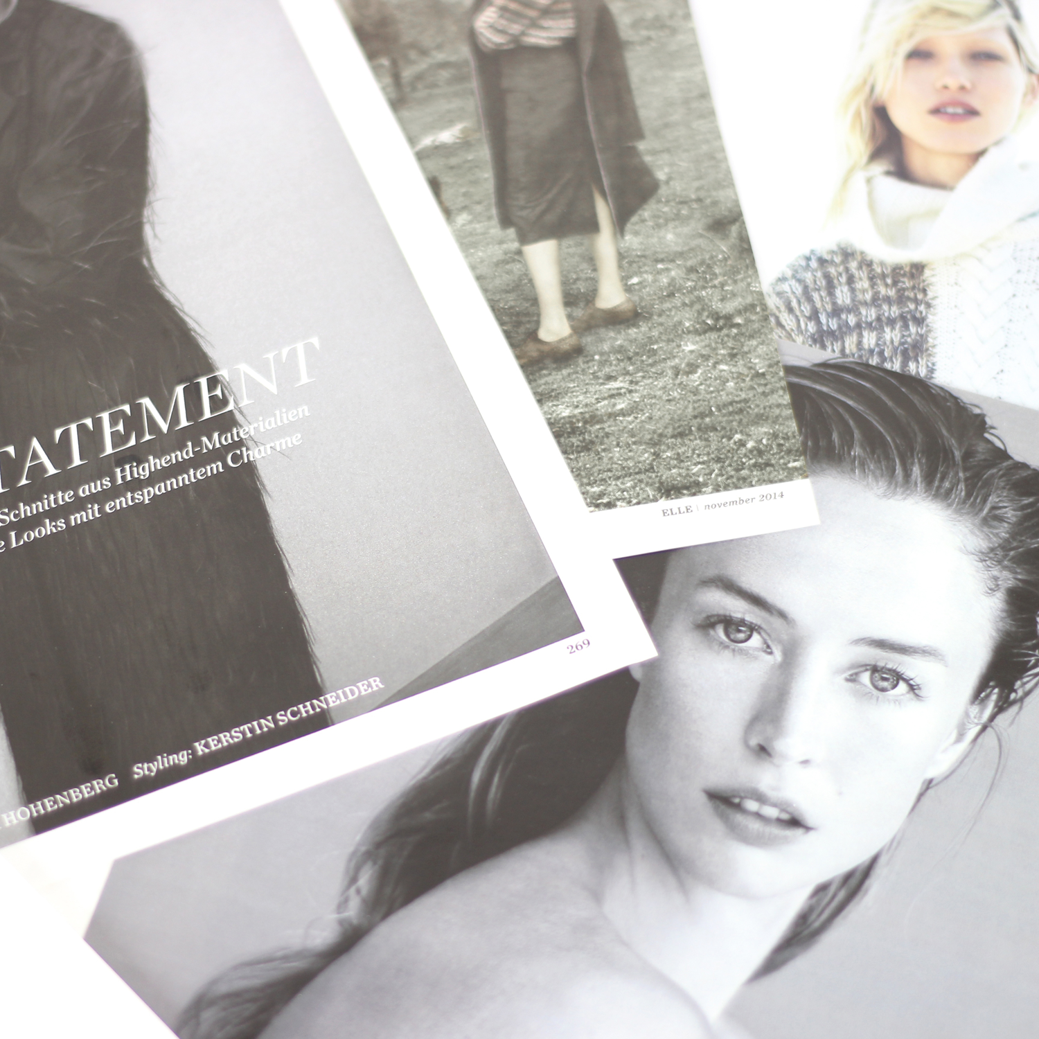
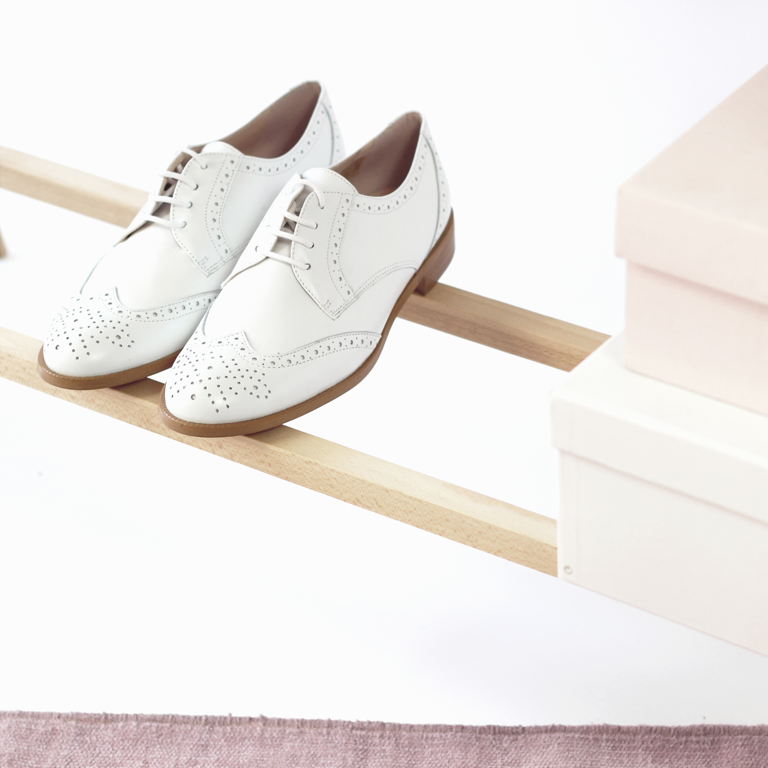
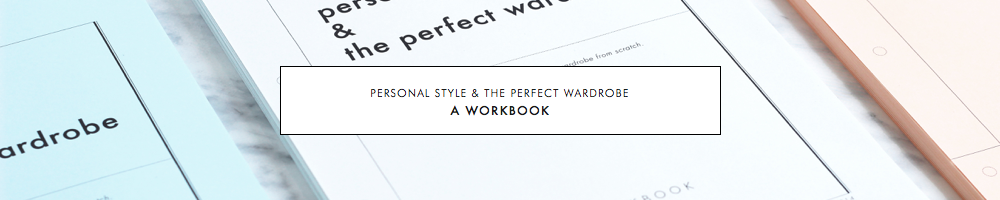
The 10 Step Wardrobe Revamp
The 10 Step Wardrobe Revamp got a big makeover as part of the redesign.
It now comes with several completely new steps and exercises, and is much more in-depth than the previous version. Rather than just being a broad overview, it's now a one-stop guide that tells you everything you need to know to overhaul your wardrobe from scratch.
There's a separate page for every single step with concrete instructions and a list of related blog posts that can help you delve deeper. That way you can choose the extent of your revamp yourself: Complete just the basic to-dos for each step or delve deeper for some or all steps, using the recommended blog posts.
You can check out the overview of the whole revamp here, or click any of the photos above to go to a specific step.
FAQ
Apart from the 10 Step Revamp, there is also lots of new stuff to read in the updated FAQ, including answers to super common questions like "Should I build a capsule wardrobe?" or "Where are you from?" (no it's not Sweden and I'm also not Dutch, not sure where people get that from :)).
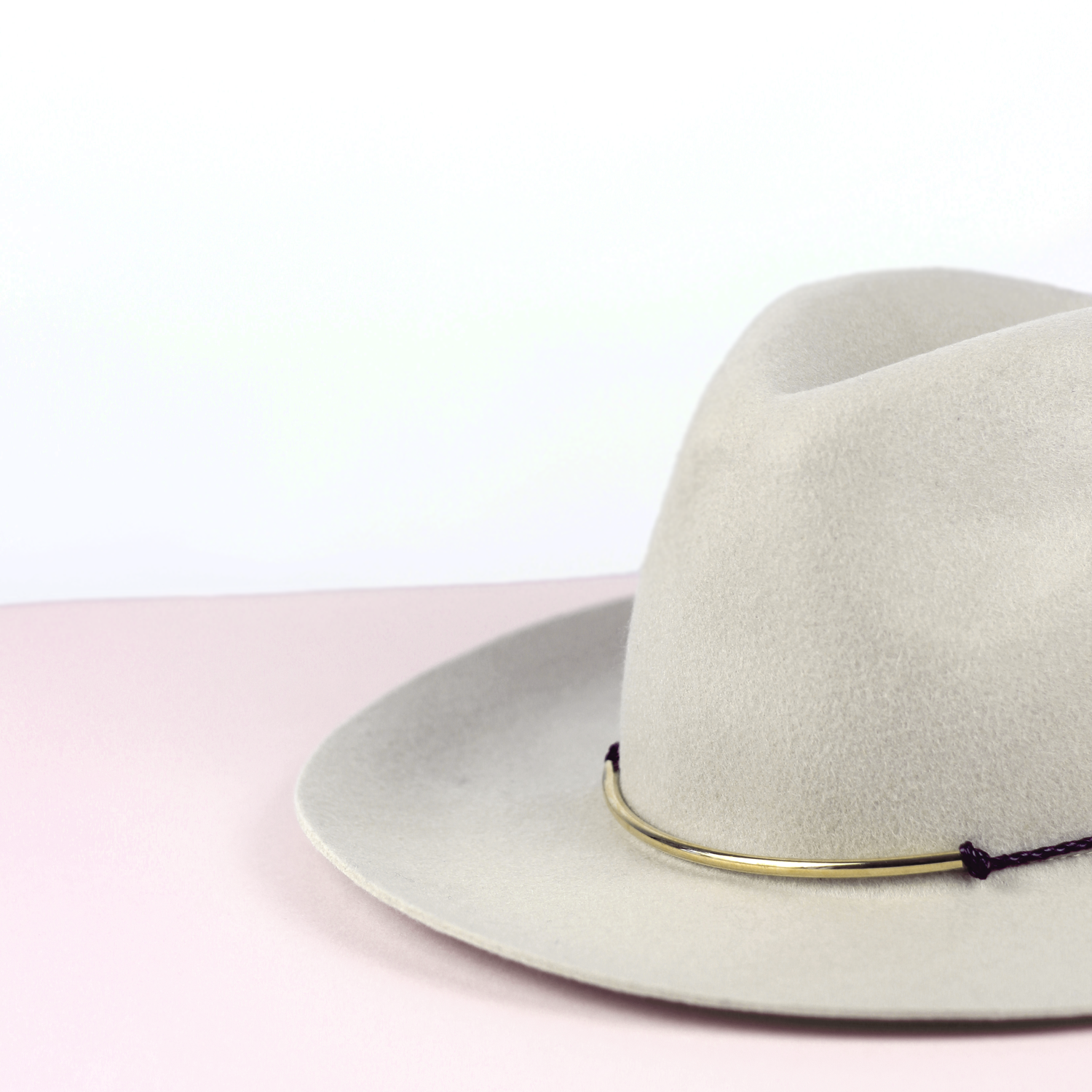
Categories
Another thing that's new around here is the category system. All blog posts are now organized into six clear-cut categories for easy navigating. Each category page (click any photo below) also features a list of the most popular posts, so you don't have to go digging through the archives. Unless you like digging :) In that case you now also have the option to view this entire blog in a traditional scroll-through format (the button for that is on the bottom of each category page).


Responsive layout
One more thing I am very excited about: INTO MIND is now fully responsive. So many of you read this blog on your phone or on a tablet, even though it admittedly wasn't the most comfortable experience until now. With the new design (which runs on Squarespace), everything should be easy to read and look good, no matter what device you are on.
Have fun exploring the new site and if you have any questions, shoot me an email!
P.S.: Some of the links to other INTO MIND blog posts aren't working properly yet, it seems. Sorry about that! I'll get that and any other minor kinks fixed asap, but it might take a couple more days. As a workaround to the link issue you can directly search for the posts here.